10 Jan How to pick a neutral wall colour
Why do property stylists generally recommend painting walls white, off white, cream or beige? Introducing white and neutrals into your home creates a mood of relaxation and refinement and a space that anyone can walk into and feel comfortable without questioning the palette.
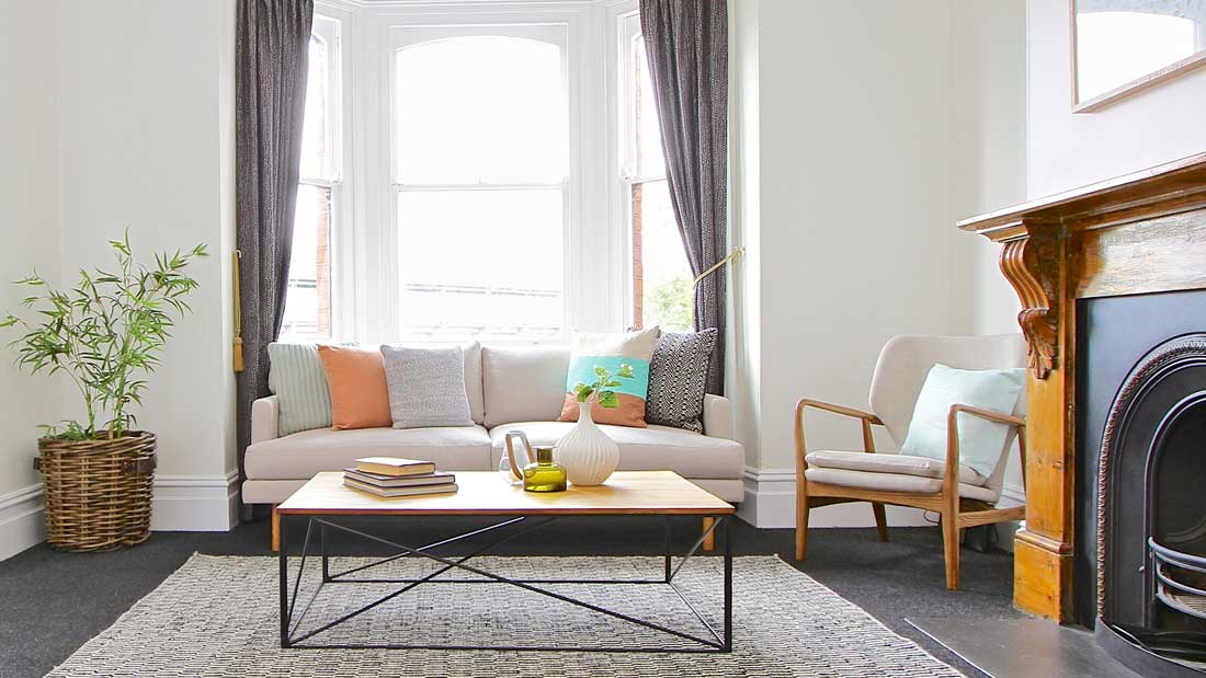
Neutralising your walls gives a perfect blank canvas for beautiful splashes of colour in cushions, artwork, flowers and throws. It creates a feeling of spaciousness in a room and lets plenty of natural light bounce around. Whites can also hide imperfections in old walls. They are an amazing tool for tired, dark or small interiors. White works with any other colour choice and can be used to create a contemporary feel when mixed with blacks and greys or create a warm and softer look when mixed with browns and beiges.
But how do we choose the right white? Cool whites have a blue undertone and can look clinical and stark but do work well in normally well-lit areas that get lots of sun. Typically the cooler colours tend to lend themselves more to the contemporary modern homes. Warm whites have a yellow, brown or pink undertone and work well to inject softness and create a cosy atmosphere. The warmer colours are more suited to warmer home styles that are a little more traditional. Biscuit tones can have a heavy yellow or pink base and tend to have a dated feel to them. Brown and red under toned paints are more contemporary. I quite often recommend Dulux Whisper White, which is a warm white, and works beautifully in both new builds and mid century homes as does Dulux Vivid White, which is a cool white.
I particularly love the warm greys. Greys can also be either cool or warm colours. Just don’t opt for a very pale grey as it may end up looking like a dirty white. Greys can result in a casual and relaxed look or even chic and elegant. Resene Sea Fog has a beautiful depth of colour and is quite contemporary.
Beige is warmer than white and can be the perfect backdrop for darker furniture and artwork especially when used with white trims and accessories to give it life. Dulux White Duck is a classic example of this. Avoid too much yellow base, as this will appear dated.
My pet hate is what I call builders yellow! The old Chalk USA is a culprit of this. My heart sinks when I walk into a newly built display home and it feels yellow. Even the most contemporary finishes can look old when the paint has an overly yellow feel to it.
The other thing to keep in mind is where to stop painting. Do you paint the trims and the ceiling a different colour? What about the doorframes and the doors? When I moved into our home 10 years ago I absolutely loved how modern and spacious it felt. The walls and ceilings were all white and there were no architraves or cornices. The only colour was on one wall in the stair well and this was Wasabi Green. I loved it…2 weeks later I felt like the life had been zapped out of me and so the painting began. Adam now thinks the house is so much smaller due to the many coats of paint it has had over the years in a house I promised didn’t need any work done to it!
The one colour trick was mastered by the Scandi style where all the ceilings, walls, doors, door frames and architraves were painted white. This makes small spaces have less visual breaks and appear much larger and less cluttered. The alternative to this is to highlight the wall colour by framing it. This can be done by keeping the doors, frames and all other vertical surfaces a separate colour and is perfect for medium to large size rooms. This can also be achieved by using a percentage shade of the wall colour for a softer touch.
The most important thing to consider when choosing a colour is how it looks in both natural and artificial light. The colour of your globes can throw blue, yellow or even a cold stark light and totally change the look and feel of a room.
All this being said, I do have a confession to make. My kitchen and dining room walls are nearly black in colour and have been now for more than 3 years and I love it. I have 2 large colourful Bally art prints on the wall, which are box framed in white, and they really pop. The difference is that I am living in my home and it is to my personal taste, but if I were selling I would be sure to neutralise it to ensure it appealed to as many people as possible.
This is the difference between dwelling and selling.
Until next time!
Donielle.